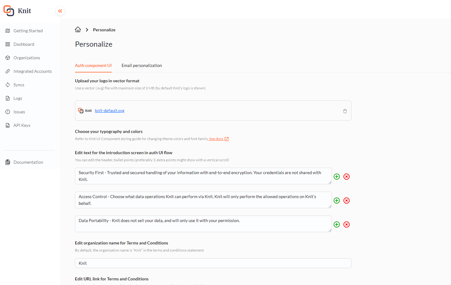
Knit UI Component customization
Colors and font styling
Knit UI component provides multiple variables to modify color palette and font family to make Knit UI Component look native to your app.
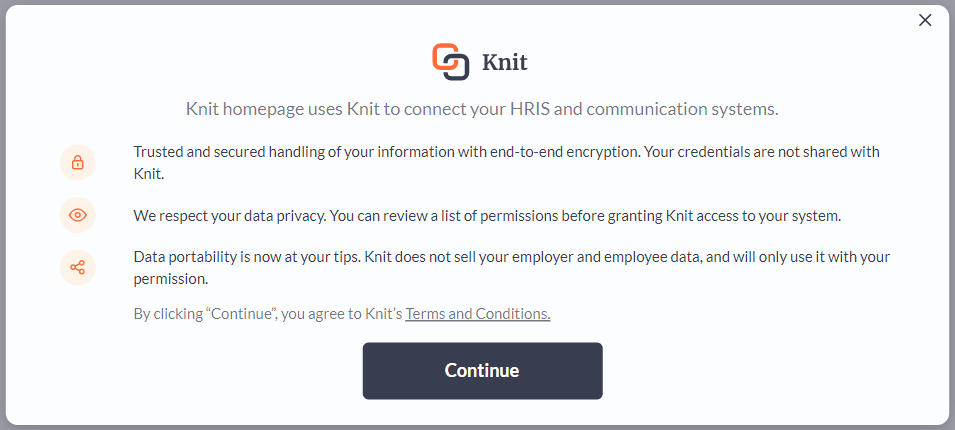
Default Styling
Colors
Color variables that can be used to modify the color palette are as follows :
| Variable | Default value |
|---|---|
--knit-primary | rgb(57, 61, 80) |
--knit-secondary | rgba(57, 61, 80, 0.05) |
--knit-success | rgb(5, 158, 5) |
--knit-failure | rgb(255, 0, 0) |
--knit-awaiting | rgb(255, 228, 126) |
--knit-grey | rgba(57, 61, 80, 0.7) |
--knit-lightgrey | rgba(57, 61, 80, 0.5) |
--knit-branding | rgb(255, 108, 55) |
--knit-branding-alt | rgba(255, 213, 164, 0.25) |
--knit-info | rgb(29, 136, 254) |
--knit-table-header | rgb(245, 255, 253) |
Font Family
| Variable | Default value |
|---|---|
--knit-font | Lato (Google Fonts) |
Usage
To use these variables, declare them in the styles of any parent element of the Knit UI component.
Example :
<html>
	<head>...</head>
	<body>
    <div id="root">
  		<knit-auth>
    	 ...
   	 	</knit-auth>
    </div>
  </body>
</html>
In this case, you can declare these variables in #root , body or html tag styling.
#root {
    --knit-primary: rgb(47 41 99);
    --knit-grey: rgb(149 193 203);
    --knit-branding: rgb(255 107 107);
    --knit-branding-alt: rgba(255 244 188, 0.48);
    --knit-font: Calibri;
}
An example of custom styled Knit UI Component.
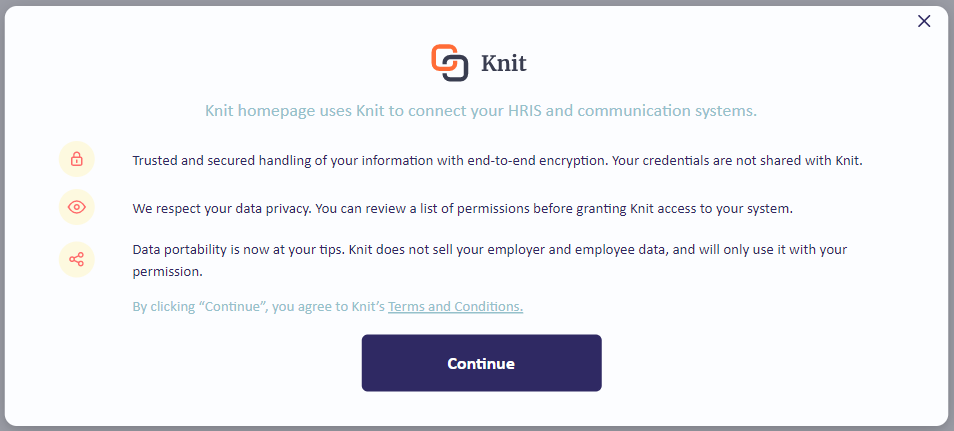
Custom Styled Component
Logo & text
You can update the introduction screen's logo and introduction points through Knit dashboard
Skip introduction screen
To skip/disable the introduction screen, set the skipIntro attribute in knit-auth component.
// Backend call to generate & get the authSessionToken
const newSessionFn = (e?: CustomEvent) => {
  e?.preventDefault();
  // Hit the backend to generate authSessionToken
      fetch('https://yourbackend.com/getSessionToken', {method:"GET"}).then(res=> res.json())
    .then((r:any) => {
      // UI Auth component won't open with a empty session token
      knitRef?.current?.setAttribute("authsessiontoken", r.msg.token);
      // Set skipIntro attribute to disable the introduction screen
      knitRef?.current?.setAttribute("skipIntro",'');
    })
    .catch((err: any) => {
      console.error(err);
    });
};
<template>
<div>
<!-- Set skipIntro attribute to disable the introduction screen -->
<knit-auth
skipIntro
:authSessionToken="token"
@onNewSession="onNewSession"
@onFinish="onFinish"
><button slot="trigger">Open Knit</button>
</knit-auth>
</div>
</template><!-- Set skipIntro attribute to disable the introduction screen -->
<knit-auth [authSessionToken]="token" [skipIntro]="true" (onNewSession)="onNewSession()" (onFinish)="onFinish($event)">
<!-- Declare a clickable element (preferably a button) as child that has a slot attribute with value 'trigger' -->
<button slot="trigger">Integrate with Knit</button>
</knit-auth>...
<!-- Set skipIntro attribute to disable the introduction screen -->
<knit-auth id="knit-dev" skipIntro>
<!-- Declare a clickable element (preferably a button) as child that has a slot attribute with value 'trigger' -->
<button slot="trigger" class="slot-btn">Integrate via Knit</button>
</knit-auth>
...