Use these APIs to send messages/nudges on Slack/MS Teams/Email
Designing messages in Knit messaging format
In this tutorial when we refer to markdown then it is about Knit message formatting
Knit supports two types of messages -
Default message type is non interactiveUsing send message API, update message API always remember
- Default messsageType query parameter is "nonInteractive". You have to supply "message" key in request body.
- For Interactive messages query parameter is interactive and you must supply right json object in "interactiveMessage" in request body.
Non interactive text message
This is simple markdown message which you can supply to Knit API to send message.
{
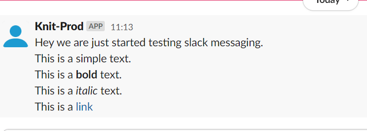
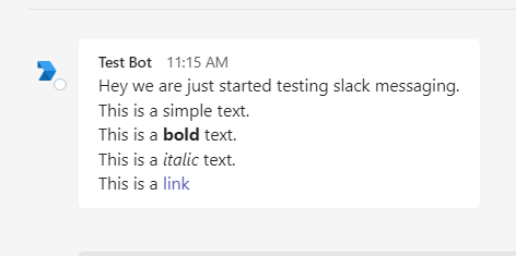
  "message": "Hey we are just started testing slack messaging.\nThis is a simple text.\nThis is a **bold** text.\nThis is a _italic_ text.\nThis is a [link](https://google.com)"
}
The below sample shows how will it look like
Slack

MS Teams

Interactive Messages
Interactive message is json object having three components :
- Destination This is the valid URL (starting with http/https) where you want Knit to send the interaction payload.
- Interactive components This is array of interactive component objects. Currently we support only one interactive component:
- Button This is similar to normal button in slack / teams. It can have following fields:
- Interactive component type
- id -> user passed id for button
- label-> text shown to user on button
- value -> user passed value string.
- style (optional)
- Button This is similar to normal button in slack / teams. It can have following fields:
Button style can only be applied to Slack ButtonsThere are three button styles supported by Slack:
primary -> Green button
danger -> Red button
default -> No colour
 "interactiveComponents": [
            {
                "id": "approveBtn",
                "label": "Approve",
                "value": "value1",
                "style": "primary",
                "interactiveComponentType": "button"
            },
            {
                "label": "Deny",
                "id": "denyBtn",
                "value": "value2",
                "style": "danger",
                "interactiveComponentType": "button"
            },
            {
                "label": "Neutral",
                "id": "neutralBtn",
                "value": "value3",
                "interactiveComponentType": "button"
            }
]- Sections This is array of section object which are non interactive component of message. These sections can be arranged inside section array object to design messages. There are currently two types of section
- Text Block This is simple text box with Knit supported message formatting. This can be used place descriptive text about message.
{ "sectionType": "textBlock", "text": "This is simple text message." }- Key Value section This can be used to highlight some key points of message. There is array of key value pair where you can put key points of message.
{
  "sectionType": "keyValueSet",
  "values": [
    {
      "key": "Key 1",
      "value": "value 1"
    },
    {
      "key": "Key 2",
      "value": "value 2"
    }
  ]
}
Now we are familiar with all three component of interactive message . We can design interactive message object using definitions mentioned above.
Example
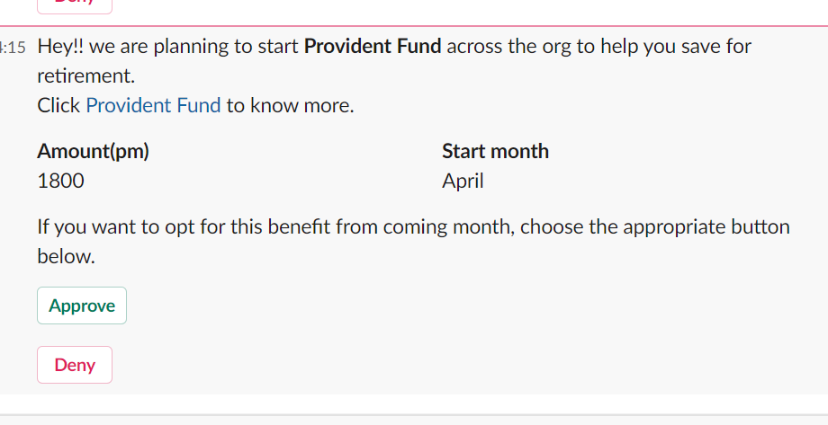
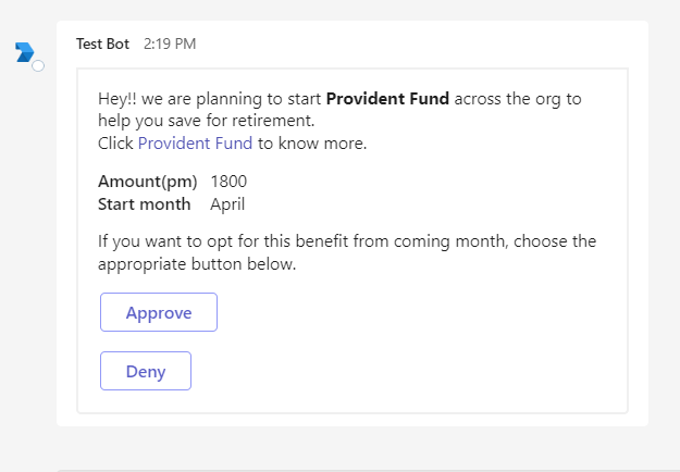
Let say Knit has started Provident fund deduction for its employee. So we have to ask individual whether they want to opt for it. We will have message structure like
- Text area describing details about provident fund.
- Key value section highlighting amount and starting month.
- Text area asking users confirmation
- Buttons: Approve, Deny.
- Destination : A valid URL
Now we will put all the non interactive component in section array in the order we want to show in message and after we put interactive component i.e. buttons.
        "sections": [
            {
                "sectionType": "textBlock",
                "text": "Hey!! we are planning to start **Provident Fund** across the org to help you save for retirement.\nClick [Provident Fund](https://www.epfindia.gov.in/) to know more."
            },
            {
                "sectionType": "keyValueSet",
                "values": [
                    {
                        "key": "Amount(pm)",
                        "value": "1800"
                    },
                    {
                        "key": "Start month",
                        "value": "April"
                    }

                ]
            },
            {
                "sectionType": "textBlock",
                "text": "If you want to opt for this benefit from coming month, choose the appropriate button below."
            }
        ],
        "interactiveComponents": [
            {
                "id": "approveBtn||provident_fund",
                "label": "Approve",
                "value": "emp_123",
                "style": "primary",
                "interactiveComponentType": "button"
            },
            {
                "label": "Deny",
                "id": "denyBtn||provident_fund",
                "value": "emp_123",
                "style": "danger",
                "interactiveComponentType": "button"
            }

        ],
        "destination": "https://sample-url.com/pf"
    }
See the below images how will it look in MS Teams and Slack.
Slack

MS Teams
